I think it looks really sleek, I love the new font. Definitely an upgrade from their weird circle/line/square thing...
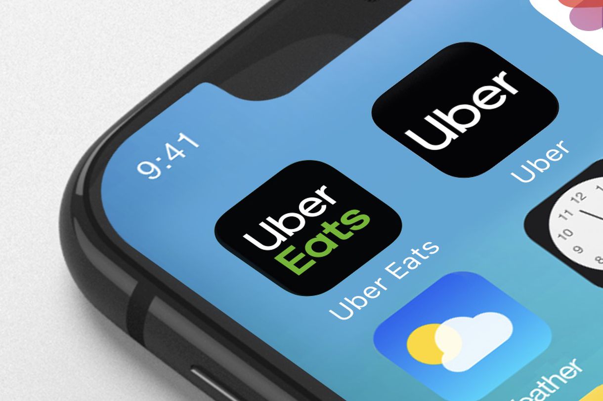
https://www.theverge.com/2018/9/12/17851248/uber-new-logo-font-app-design
News, media buzz around the industry, cool images, and more. Share them here, and discuss with others in the rideshare industry, including Uber drivers, passengers, journalists, and rideshare companies.

I think it looks really sleek, I love the new font. Definitely an upgrade from their weird circle/line/square thing...
https://www.theverge.com/2018/9/12/17851248/uber-new-logo-font-app-design
Comments
Still think they should be called HEIL-O.
Anyone know if we can order new one for our vehicle to replace the ugly old ones?
I saw somewhere that they’ll be rolling out new stickers and swag in the upcoming months. They’ll proactively send them out so you don’t need to ask. (Though, I’m sure it doesn’t hurt to ask.)
Just got a notice from Uber. They will be available in November.
Did you ever get your new stickers.
No. I just received a message on Monday to confirm my address so they can send me my new stickers.
I received my new sticker a few days ago. Plain old "Uber" maybe 4"/5" high. Sticker not stickers:) Only sent 1 sticker even though I have 2 cars on platform![]() and front & back windshield. Sorry for bad pic but my phone crashed using my sons (not used to it, obviously not very good with it):). Can't wait to get mine back although T Mobile's Insurance Co. is absolutely awful.
and front & back windshield. Sorry for bad pic but my phone crashed using my sons (not used to it, obviously not very good with it):). Can't wait to get mine back although T Mobile's Insurance Co. is absolutely awful.
Thank you.
Thinking optimistically, at least now the passengers will be better able to identify Uber drivers. Passengers look at the logo now and still don't know it's the Uber logo.
No joke. That last logo never made any sense. I thought it was ugly when it came out, but I thought maybe it would grow on me. And I thought maybe I would find some hidden meaning in it eventually.
It did not, and I did not.
Their last logo sucked so bad. Looks like they figured that out. This one looks cleaner. But it is boring as all get out. They couldn't hire a couple of decent graphic designers with all the money they don't give to us?
Here's my favorite. Should go back to this.
That CMO must have her shit together, there for two days and already unveiling new logos? What kind of sorcery is this?!
Can this be considered a logo, it is literally just the word Uber. SMH
Well think about it, so many "logos" are really the companies name. Coca-Cola, Dell, IBM, even Google. This is very common.
I did notice that. Well, anything is better than the previous logo which was like a weird, "C"?
You spelled chips ahoy incorrectly.
Too clean, too sterile, no graphics edge. Disappointing and uninspiring unless you are a big fan of Sesame Street. A brand needs to stand for something and have a personality. This has none.
They can change their appearance but they will always be 666.
That little video with the word uber becoming two lines and like opening up was pretty sick
Remember that old U – seems so dated now.
It looks so much friendlier than their old one, which was ugly and meaningless. They are definitely trying to change their image here to be softer and more welcoming. I think it might work, too.
That "logo" is now just text though. They have decided to not any logo or images. Just word. I guess their name itself is enough.